process
Les Agapes is a fictional Demeter certified biodynamic wine brand, imagined by a couple of winemakers from Maine (France). They aimed to break away from traditional codes to create an image that is 'young, rogue, and unpretentious.
After immersing myself in the aesthetics of mixed media and 'living wine,' I centered the identity on a deconstructed wordmark. The raw style and deliberate imperfections mirror the handcrafted, natural quality of the wine.
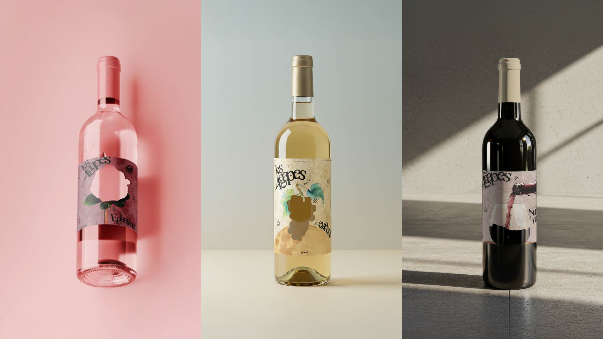
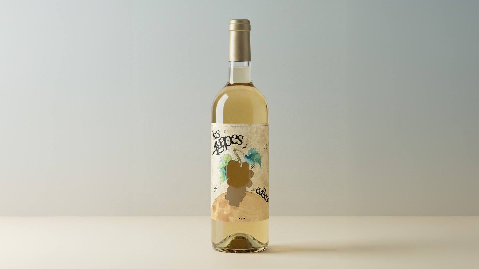
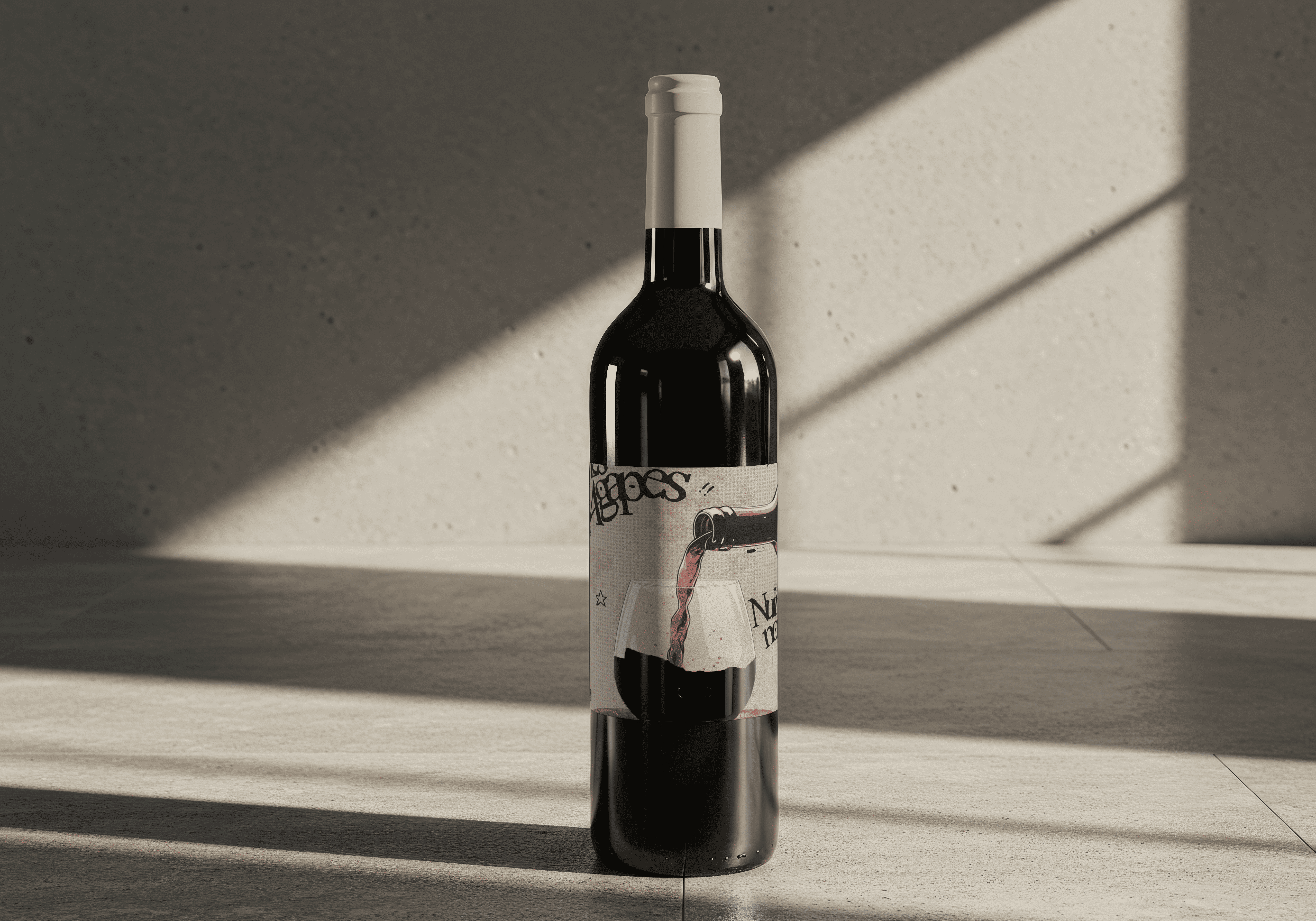
The design of the three bottles is unified by a play on transparency: each label features a specific die-cut that integrates the wine's color into the artwork.
The white (L'Évident) evokes the lunar cycles associated with Demeter certification, drawing inspiration from The Little Prince. The rosé (L'Églantine) focuses on sensory appeal with a rose-shaped cut-out, while the red (Nuit Noire) illustrates the wine's roots and the spirit of sharing found in the cellar.